Four Forty Four
Creatively crafted four fictional campaigns for four diverse brands, showcasing informed creative direction in four unique industries.
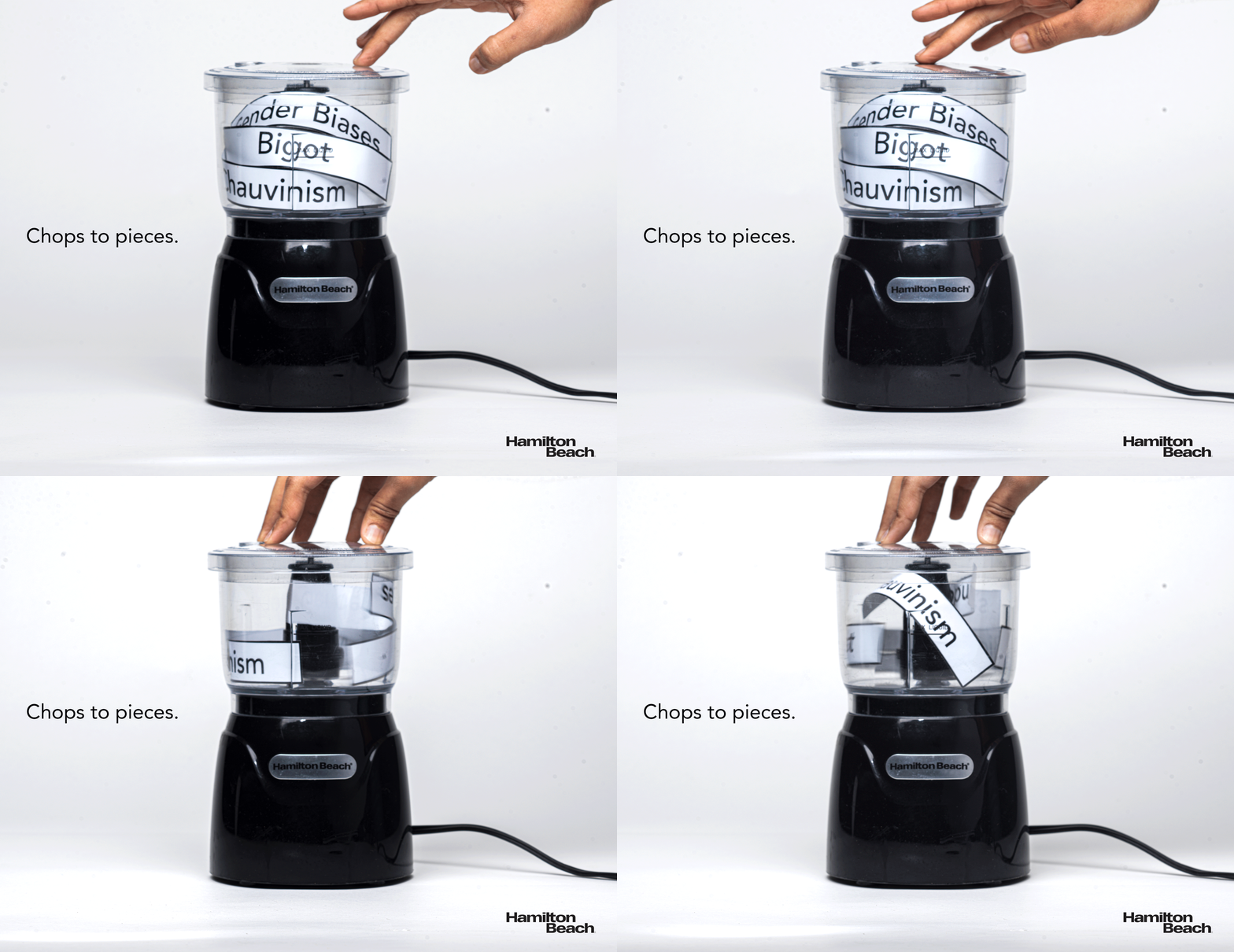
Hamilton Beach
The campaign for the home appliances company Hamilton Beach’s “Stack & Press Bowl Chopper” took a humorous approach by signifying the chopping of patriarchy. Atypical to the brand’s advertising strategy, the objective for this campaign was to leave the audience with a dual message — a utilitarian one, and the other a social one.


Durex
For world’s leading sexual well-being brand, Durex, the objective was to produce quirky advertisements while still breaking the stigma and talking about underrepresented subjects. The first advertisement showcases that the brand caters to many a different sizes. The second advertisement talks about the importance of safe sex. The direction for this campaign was to indirectly portray both of the above mentioned messages in a manner that doesn’t seem lewd.


Allstar
Allstar, the fencing clothing, weapons, and installations brand is known for their high quality and steadily evolving nature. The campaign above shows Allstar products in a manner unconventional to the brand — a manner that shows their products in a real life setting. The campaign was almost like a testimonial for the values of innovation and performance the brand is known for.


Hershey's
Hershey’s’ advertising strategy is traditionally focused on the emotional connection consumers have with the Hershey’s brand as a whole. The vision behind this campaign was to stay on track with Hershey’s actual advertising strategy but steering away from the usual imagery and videos. As such this campaign is in itself a pun for the “Hershey’s Kisses” chocolate. Each kiss stain represents a different flavour of the chocolate. While a kiss stain intrinsically is a symbol of emotion and love, the usage of graphical illustrations is a step away from what Hershey’s as a brand conventionally do.


